EcoBenefits Project
Group Name: MammaMia!
Group Members (alphabetic order):
- Gallo Ivan
- Ivan Diana
- Kunst Emilia
- Pastorino Edoardo
- Sadeghi Garjan Mahyar
About Project and Data
The website offers the possibility to view all the charts relative to
the different assignments of the Data Visualization course
@UniGe,academic year 2022/2023, made by the
MammaMia! group.
In the subpages relative to the different assignments is possible to
find different charts with various techniques of data visualization,
to show the data and present conclusions on them.
The data come from a
GitHub Repository
about trees abundance and position in the municipality of Trento,
mainly in form of json and geojson files.
(image from the online TrentoTreeMap)
Assignment 1 - Comparing Categories
In the first assignment we have to compare the tree species abundance
and distribution, also with regard to the various "circoscrizioni"
(neighborhood) in which the trees are placed.
Specifically we created five charts:
The first one is a simple barchart that shows the sorted tree
abundance (top 20) and others info.
The second one compares the neighborhood and the tree types (for the
top 5 tree type) with a stacked barchart.
The third chart's purpose is the same of the previous one, but in this
case we used small multiple charts, dividing for each tree specie.
The fourth one is again a variant version of the second one, showing a
stacked bar chart using the percentage of the tree species
distribution.
The fifth one shows the distribution of the tree species in percentage
divided by neighborhood, using some waffle charts.
Assignment 2 - Distribution
In the second assignment we have to consider the distribution, in
different kind of visualization, of four tree's "size measure", that
are the height (m), the crown width (m), the canopy cover (m
2) and the crown height (m).
It is possible to select the desired measure using the dropdown menu.
Also this time we created five charts:
The first one is an histogram that shows the distribution of each of
the four size measure for all the tree species.
Also the second one displays the same size measure distribution, but,
this time, using a box plot chart, in which we can easily see outliers
and where is the dense part o the data distribution.
The third chart's purpose is to show the correlation between the
CO2 production of the top 5 tree types (considering the
abundance) with their size measures.
The fourth one is the small multiple version of the previous one,
showing the same correlation separately for each tree type, again in a
scatter plot.
The fifth and last one shows the correlation between size measures and
CO2 production, of the top 6 tree types, with the usage of
a bubble chart in which the dimensions of the bubbles refers to the
tres's canopy size.
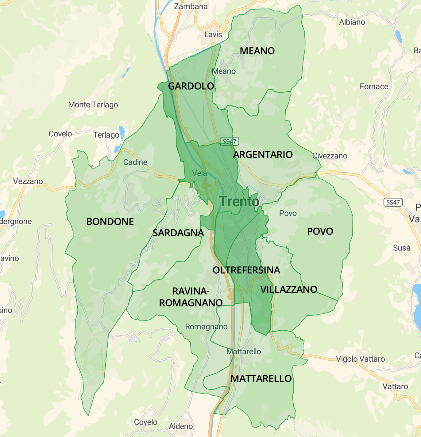
Assignment 3 - Maps
The third assignment of the Data Visualization course wants to show,
in general, the spread of the trees inside the geographical map of
Trento's city, that is divided according to its circoscrizioni,
according to different measures.
We have displayed five maps of Trento, each one provides a different
knowledge:
The first map represents the distribution of the tree abundance in
each circoscrizione.
The second one, instead shows the density
distribution of trees (considering the total sum of the trees' area
respect to the area of a circoscrizione), again inside each region of
the city.
The third one is similar to the previous, the only difference is that
we consider as measure the oxygen production of trees.
The fourth geographical rapresentation illustrates, using dots, where
all the trees are located in Trento.
In the last map we can see, where the top 10 trees, in terms of
quantity, are situated.
Assignment 4 - Temporal Data
The fourth assignment of Data Visualization concerns temporal data,
specifically for this task we have taken temporal data relative to the
daily temperature of the Salorno's city, starting from 1981 until
2021.
The first chart represents the trend of montly temperature, subdivided
in the max montly temperature, min montly temperature and average
montly temperature of the selected year. For showing the max and min
temperature we have used a line chart, while the average is
represented with a scatterplot between the two lines.
The second one is a radar chart that in this case shows three lines,
representing again the max, min and average montly temperature for the
selected year.
The last one displays the temperature's montly distribution (max and
min temperature) of the selected year using a particualr chart called
ridgline.
Assignment 5 - Flux
The aim of the Data Visualization's last assignment (the assignment number 5) is to show correlation between different measures for specific tree types. For doing that we have used a kind of flux chart called alluvial (or sankey) diagram. The only diagram of this assignment wants to correlate the carbon storage in kg, of the top ten (in terms of abundance) tree species, with the carbon storage measured, this time, in euros.